Kuku, a hydration app
Brand identity
___
April 19th, 2026
Kuku is a tiny water deity who lives in your phone and cares about your hydration so you don’t have to remember every sip. You’re juggling school drop-offs, long shifts, and a never-ending to-do list. It makes sense that tracking water falls to the bottom. Kuku keeps an eye on your drinks—water, coffee, prebiotic soda, and everything in between—and turns them into clear, easy-to-read patterns.
Kuku, aka Kukulkan, the feathered serpent deity from Mayan tradition associated with rain, water, and balance in the natural world, thoughtfully reimagined as a supportive, everyday companion in a modern app.
Brand strategy
Most water-tracking tools feel like chores: sterile apps, forgettable reminders, or notes that quietly disappear into the background. Kuku is designed to feel like a small, encouraging presence that helps you build better hydration habits without judgment. The brand pairs a clean, minimal interface with a personable character who feels like someone checking in on you, not calling you out.
As a Mexican-American designer, a trip to Mexico City and its temples, artifacts, and metro art helped reconnect me with the visual language and symbolism behind Kukulkan. Kuku carries forward Kukulkan’s associations with cycles, water, and balance—translated into an experience that fits into a busy, modern life while still honoring those roots.
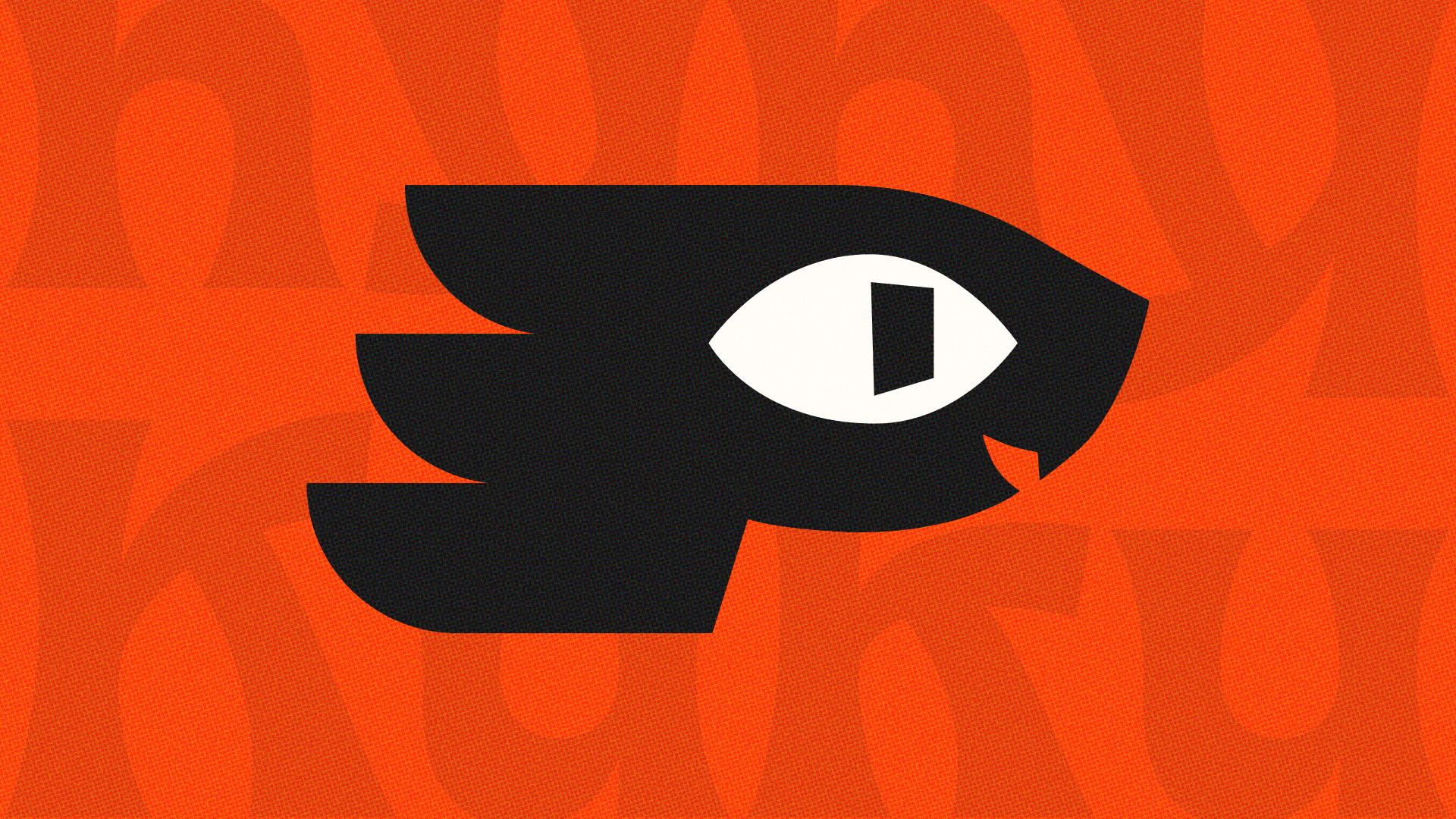
Logo
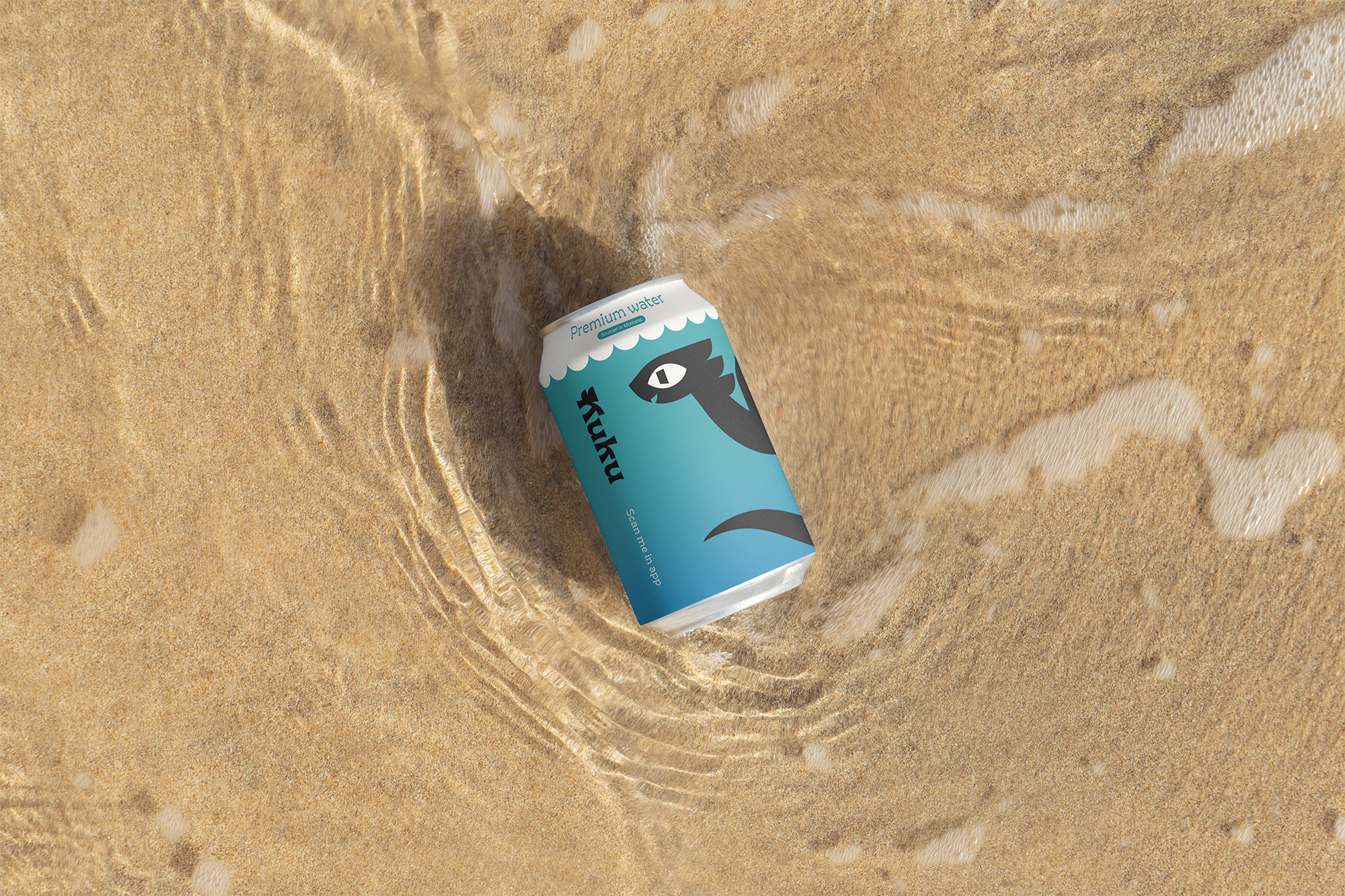
Kuku serves as both mascot and logo: a single, compact mark that has to be charming at small sizes and confident at large scale. To keep him recognizable yet minimal, the logo draws from aspective art—using the most iconic angles of each feature rather than a literal serpent illustration.
Seen from the side, Kuku’s large, eye-shaped eye, open smile, and single visible fang communicate friendliness and a subtle hint of his serpent nature. A forward lean and feathered mane add a sense of movement and lightness, suggesting that he’s active, attentive, and ready to help you stay on track. The result is a flexible, readable mark that can move seamlessly between UI, social content, and print.
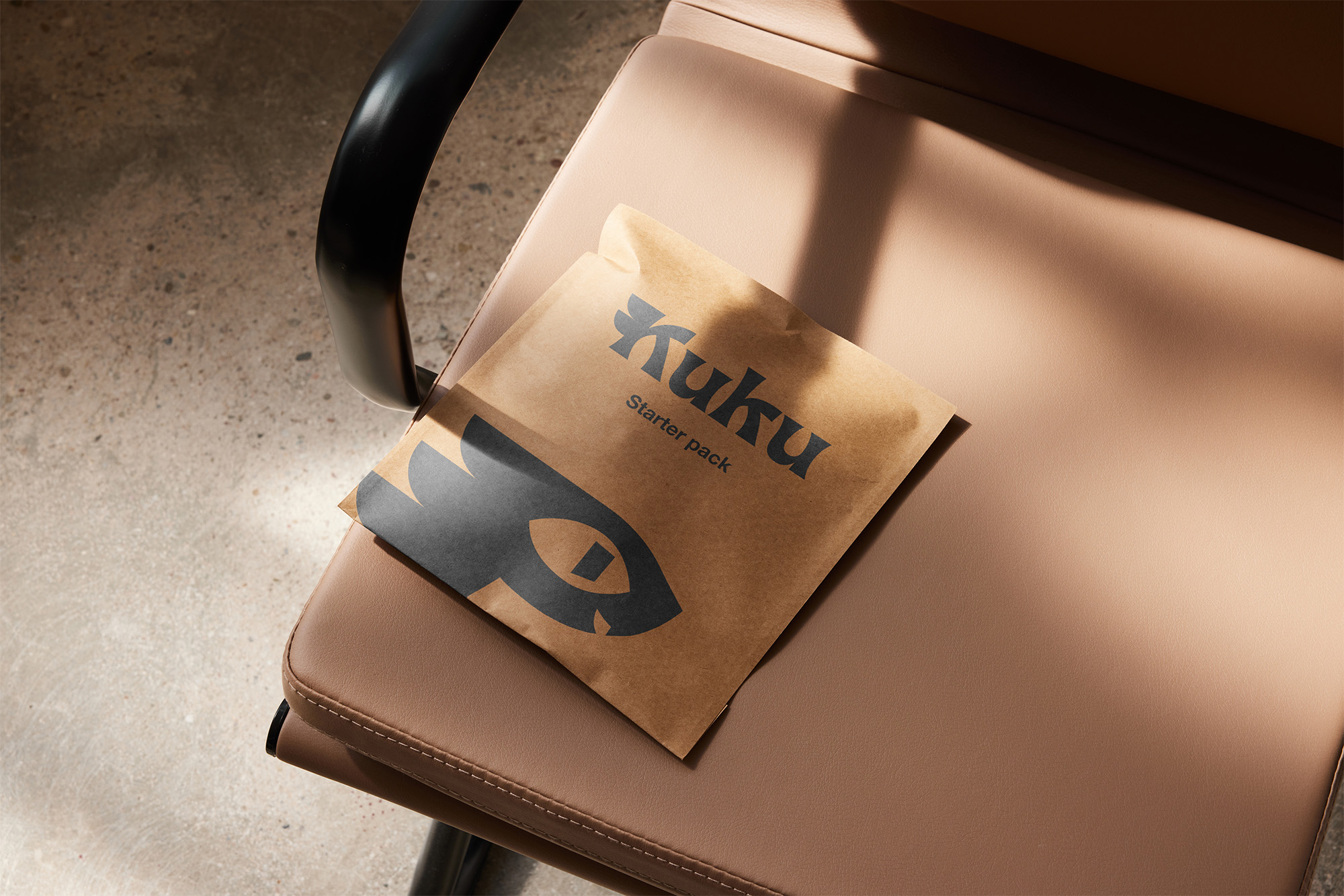
Wordmark & Typography
For the wordmark, the goal was to capture a sense of rounded movement and historical influence without feeling like pastiche. We chose Gardein for its organic shapes and built-in personality.
In practice, Gardein handles headings and brand moments, while a clean secondary sans-serif typeface supports the product UI for quick, legible logging. The typography system lets Kuku be expressive where it matters, and quiet where clarity and speed are more important.
Product design
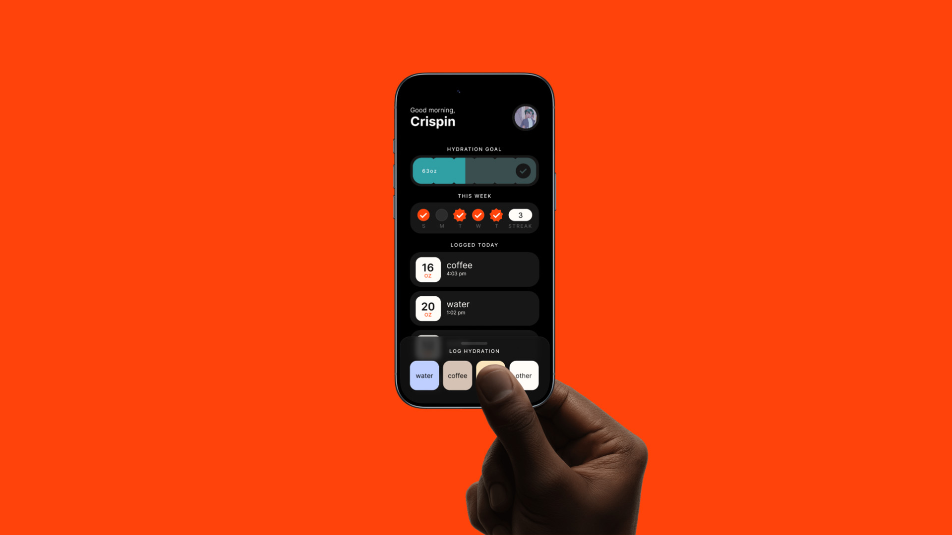
Kuku is the result of multiple concept rounds, user research, and testing sessions that focused on clarity, ease of use, and long-term habit-building. The product centers around two primary planes of interaction: the dashboard, where users understand their day at a glance, and the fluid log drawer, where they quickly add what they’re drinking.
On the dashboard, a progress bar shows daily hydration goals and streaks, while an additional marker appears when more than 70 percent of intake comes from water, reinforcing that not all fluids are equal. A running daily log near the top helps users quickly confirm what they’ve already entered, with a customizable widget area below for metrics like caffeine, sugar, or water ratio based on their priorities. The fluid log drawer opens partially by default, with a translucent background hinting at the dashboard underneath and inviting users to scroll. Quick-access beverages are fully customizable, offering common sizes as one-tap options and a flexible control for anything more specific. Throughout the experience, Kuku’s tone is calm, encouraging, and a little playful—supportive of better hydration habits without pressure.
