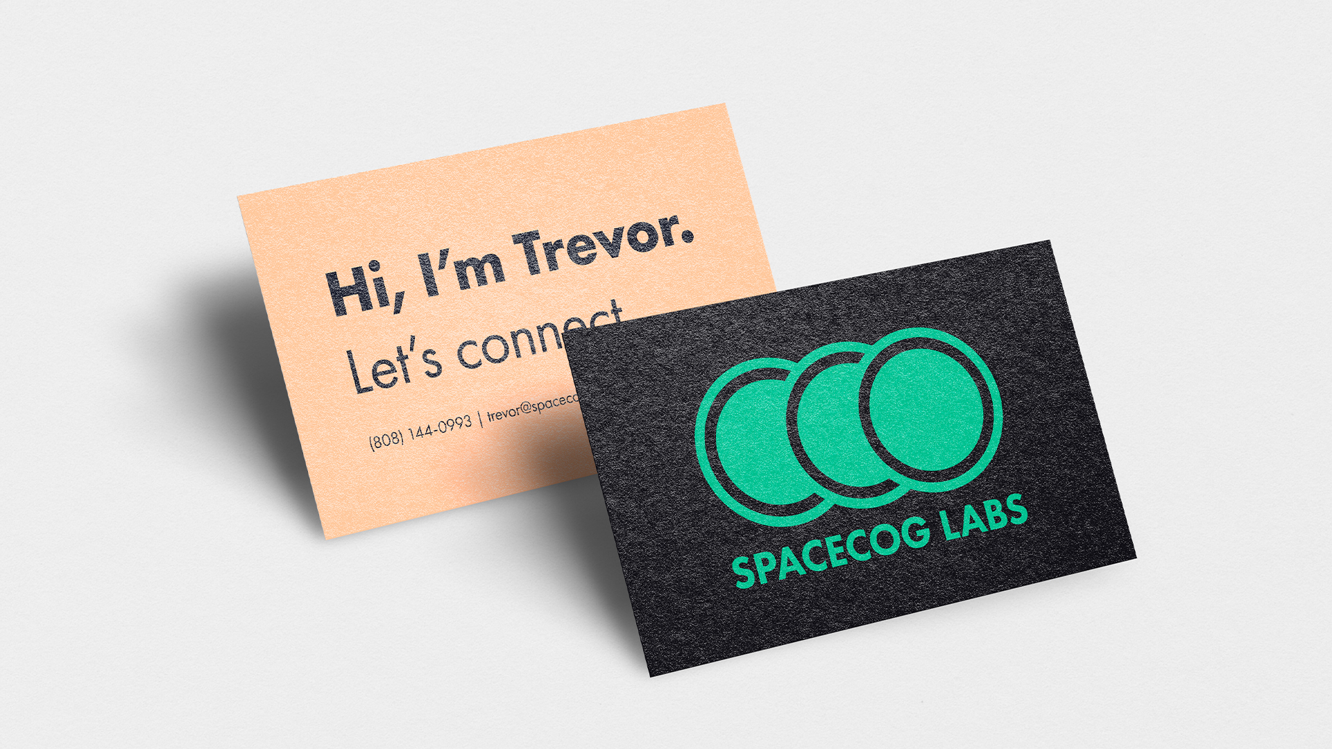
Spacecog Labs
In this project we helped Trevor redevelop his brand, Spacecog Labs, as they transitioned their company from consultation to creating original educational content on a variety of stem projects. early in our work we contacted with Trevor to identify core traits from the original branding we wanted to retain and where we could evolve. The finalized brand proposal was met with enthusiasm and approved without revision.
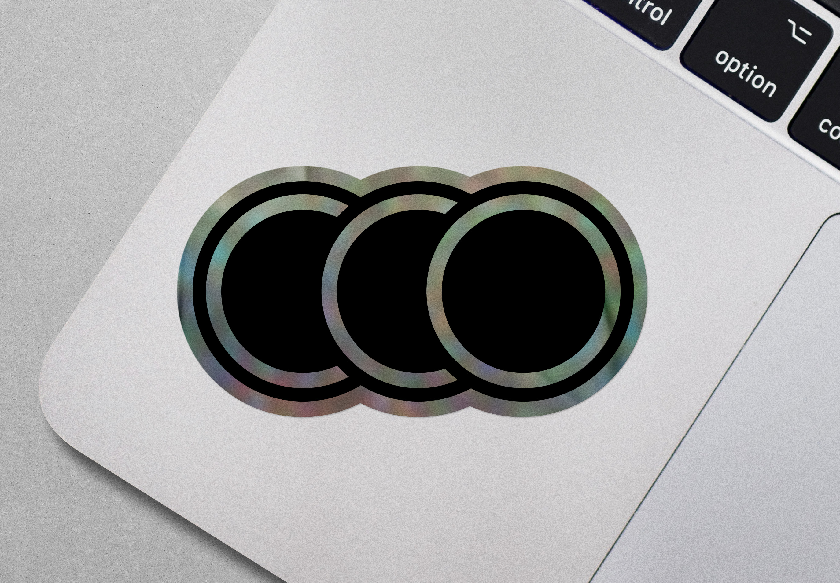
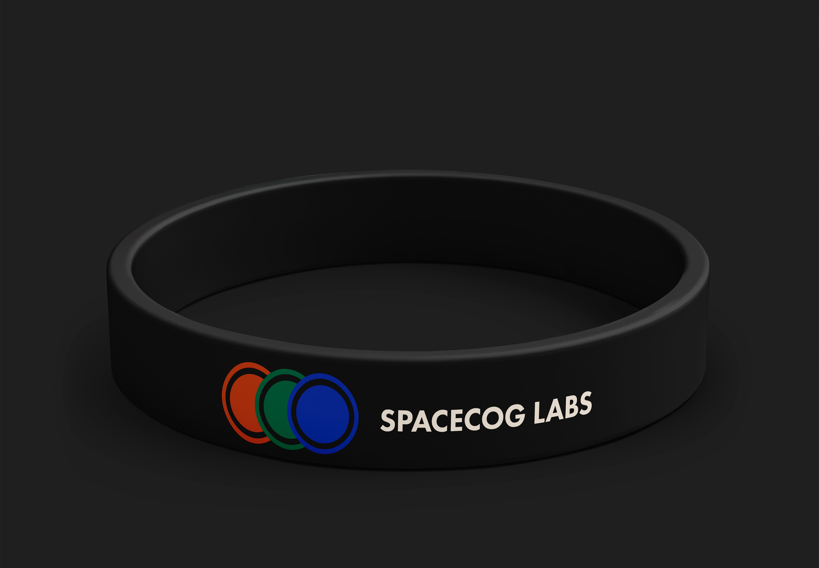
Logo concept:
A direct evolution and modernization of the Spacecog Labs logo, this refresh focuses on creating a clean and adaptable brand for flexible use in video and on paper.Our new image takes on new meaning. Nicknamed the hyperloop, this logo has a sense of movement symbolizing their viewers' skill and understanding within a topic expanding and progressing. The circular design also mimics the helmet of an astronaut (depicted in their original branding), though now our friend isn't alone but rather belongs to a community.